Why iGaming Landing Pages Fail to Convert
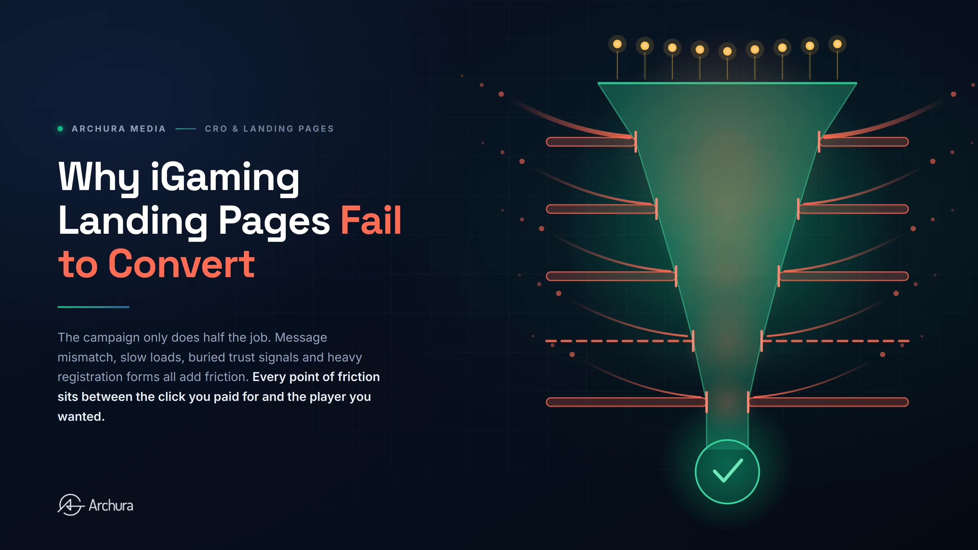
Paid traffic can be expensive in iGaming, but the campaign is only doing half the job. Once a player clicks, the landing page has to turn that interest into a registration, deposit, app install, or another defined action.
When an iGaming landing page underperforms, the problem is rarely one button or headline. Conversion usually breaks because the page does not match the traffic source, explain the offer quickly, build trust, or make the next step easy.
The strongest iGaming landing pages are focused, fast, mobile-first, locally relevant, and built around one clear conversion path.
Why iGaming Landing Page Conversion Is Different
Casino and sportsbook pages operate in a high-friction environment. A visitor may need to understand a bonus, confirm eligibility, trust the operator, check payment options, accept verification requirements, and decide whether to continue.
A strong page needs to make the offer clear, build trust, reduce friction, support local expectations, and include required compliance and responsible gaming information.
1. The Landing Page Does Not Match the Ad
A common conversion problem starts before the user reaches the page.
An ad may promote a specific welcome offer, football market, casino game, payment method, or event. The click then sends the user to a generic homepage or a page where that message is difficult to find.
If the ad says “Weekend Football Offer,” the landing page should continue that exact story. The headline, offer details, CTA, and supporting copy should make the transition feel seamless.
Different traffic sources often benefit from different landing page versions.
2. The Offer Is Not Clear Above the Fold
Users should not have to investigate the page to understand what is being offered.
The first screen should answer three questions quickly:
- What is this?
- Why should I care?
- What should I do next?
In iGaming, this usually means a clear headline, concise offer explanation, visible CTA, and essential terms close enough to prevent confusion.
A page can look impressive and still convert poorly if the value proposition is vague. Design should support the message, not compete with it.
3. Mobile UX Creates Friction
Most iGaming landing pages need to work as mobile experiences first.
Problems appear when a desktop layout is simply compressed onto a smaller screen. Buttons become difficult to tap, forms feel long, promotional banners push the offer down, and important information becomes harder to find.
On mobile, CTAs should be easy to reach, text readable, and forms kept as simple as the process allows.
4. The Page Is Too Slow
Heavy videos, oversized images, unnecessary scripts, third-party trackers, and poorly optimized components can delay the experience, particularly on mobile connections.
Performance work should focus on the real experience: how quickly meaningful content appears, when the main CTA becomes usable, and whether the layout remains stable while loading.
Speed is not separate from CRO. It is part of the conversion experience.
5. Trust Signals Arrive Too Late
Before registering or depositing, players need confidence in the operator and clarity about what happens next.
Useful trust information can include licensing details, payment methods, responsible gaming links, customer support access, transparent bonus terms, and clear verification expectations.
The mistake is hiding all of this at the bottom of the page.
Place trust signals where uncertainty occurs. Payment information belongs near deposit messaging. Key bonus conditions should sit close to the offer. Verification requirements should not surprise users halfway through registration.
6. Registration Has Too Much Friction
A landing page may do everything right and still lose the user at the form.
Common problems include too many fields, unclear password requirements, confusing error messages, unnecessary steps, and poor autofill support.
The goal is not to remove necessary KYC or compliance requirements. It is to make the path understandable and efficient.
Review the journey from landing page click through registration and first deposit as one connected funnel.
7. There Are Too Many Competing Actions
A conversion landing page should have one primary goal.
Yet many pages include full navigation, multiple promotions, game carousels, app links, support widgets, several bonus options, and competing CTAs.
Useful information can stay, but the hierarchy should be obvious. The main conversion action should dominate, while secondary actions support it rather than pull attention away.
8. Localization Stops at Translation
A translated landing page is not automatically localized.
Different markets can require different payment methods, currencies, sports references, offers, regulatory wording, and trust signals. The page should feel built for the market, not copied from another country and translated.
For multi-market operators, iGaming marketing and CRO should be reviewed by country and language. A layout or offer that performs well in one market may not be the best version elsewhere.
9. The Team Is Testing the Wrong Things
Changing button colors is not a CRO strategy.
Testing should begin with hypotheses based on analytics and user behavior. Look for where users hesitate, abandon forms, miss important information, or fail to reach the next step.
Higher-impact tests can include:
- Offer positioning and headline clarity.
- Shorter registration flows.
- Different structures by traffic source.
- Trust signals near conversion points.
- Mobile-first layouts.
- Market-specific payment messaging.
- Simpler bonus explanations.
Use behavioral data and A/B testing to distinguish assumptions from actual user behavior.
How to Audit an iGaming Landing Page
Review the full journey, not the page in isolation.
Check whether the ad and landing page message match. Review the first screen on mobile. Confirm the offer and CTA are immediately understandable. Test page speed on realistic connections. Complete registration yourself and document every point of friction.
Then segment performance by device, traffic source, campaign, country, and landing page. One overall conversion rate can hide very different problems.
Useful metrics include landing-page conversion rate, registration completion rate, registration-to-FTD rate, cost per registration, cost per FTD, form abandonment, and key funnel drop-offs.
Final Takeaway
iGaming landing pages fail when they make the visitor work too hard.
Weak message matching, unclear offers, slow performance, poor mobile UX, missing trust signals, complicated registration, and generic localization all add friction between the click and the conversion.
The answer is not to redesign pages based on opinion. A structured conversion rate optimization process builds a clear conversion path, observes real user behavior, identifies the biggest barriers, tests meaningful changes, and measures the result through registrations and FTDs.
A better landing page helps every acquisition channel turn more of the traffic you already pay for into valuable players.
FAQ
What makes a good iGaming landing page?
+A good iGaming landing page matches visitor intent, explains the offer clearly, builds trust, loads quickly, works well on mobile, and guides the user toward one primary action with minimal friction.
What should an iGaming landing page include?
+Core elements usually include a clear headline, offer details, CTA, important terms, trust and licensing information, payment signals, responsible gaming information, and a simple route into registration.
How should iGaming landing page performance be measured?
+Track landing-page conversion rate, registration completion, registration-to-FTD rate, cost per registration, cost per FTD, and drop-off at important funnel stages.
Should every traffic source use the same landing page?
+Not necessarily. Search, affiliate, paid social, display, CRM, and market-specific traffic can arrive with different expectations. Dedicated variations can improve message matching and make testing more meaningful.